Here are a few summary statistics of the COVID-19 pandemic. Data is from worldometers (worldwide data) and the NYT (U.S. and Arizona data). These plots will be updated approximately daily, at least until the pandemic is over. Click on the images to open a higher-resolution version in a new browser tab. Last update: 2020-07-29 (statistics valid up to the day before).
The NYT maintains an informative U.S. case count map here.
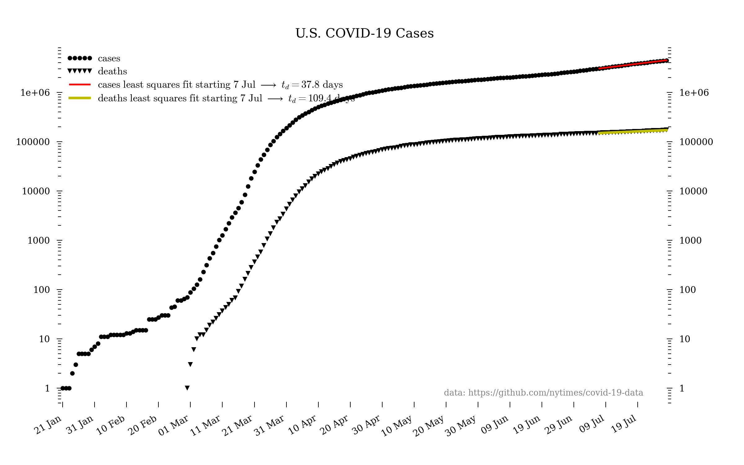
Note: the mean time between exposure and first symptoms is 4-6 days. This means that the numbers we see today correspond to people who exhibit symptoms but were infected a week or more ago.
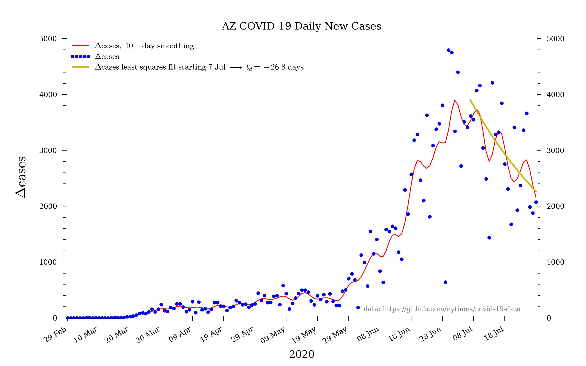
Arizona
The state of Arizona continues to badly fail regarding testing, primarily because of the ever-incompetent and inept Trump administration. These numbers are therefore likely an egregious undercount—most especially the daily new cases and daily new deaths. It would be great news if the daily new cases curve really was turning over, but, unfortunately, instead it seems more likely that this is due to Trump’s (and Republicans’ generally) unconscionable failures of governance.
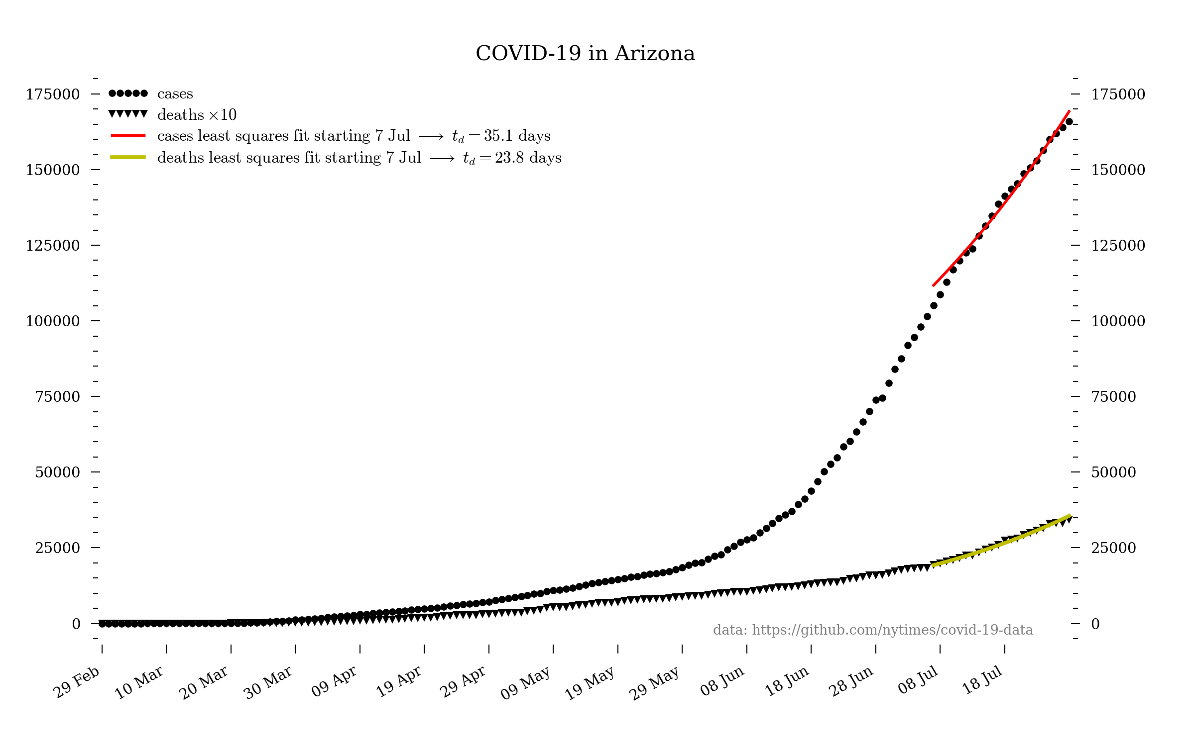
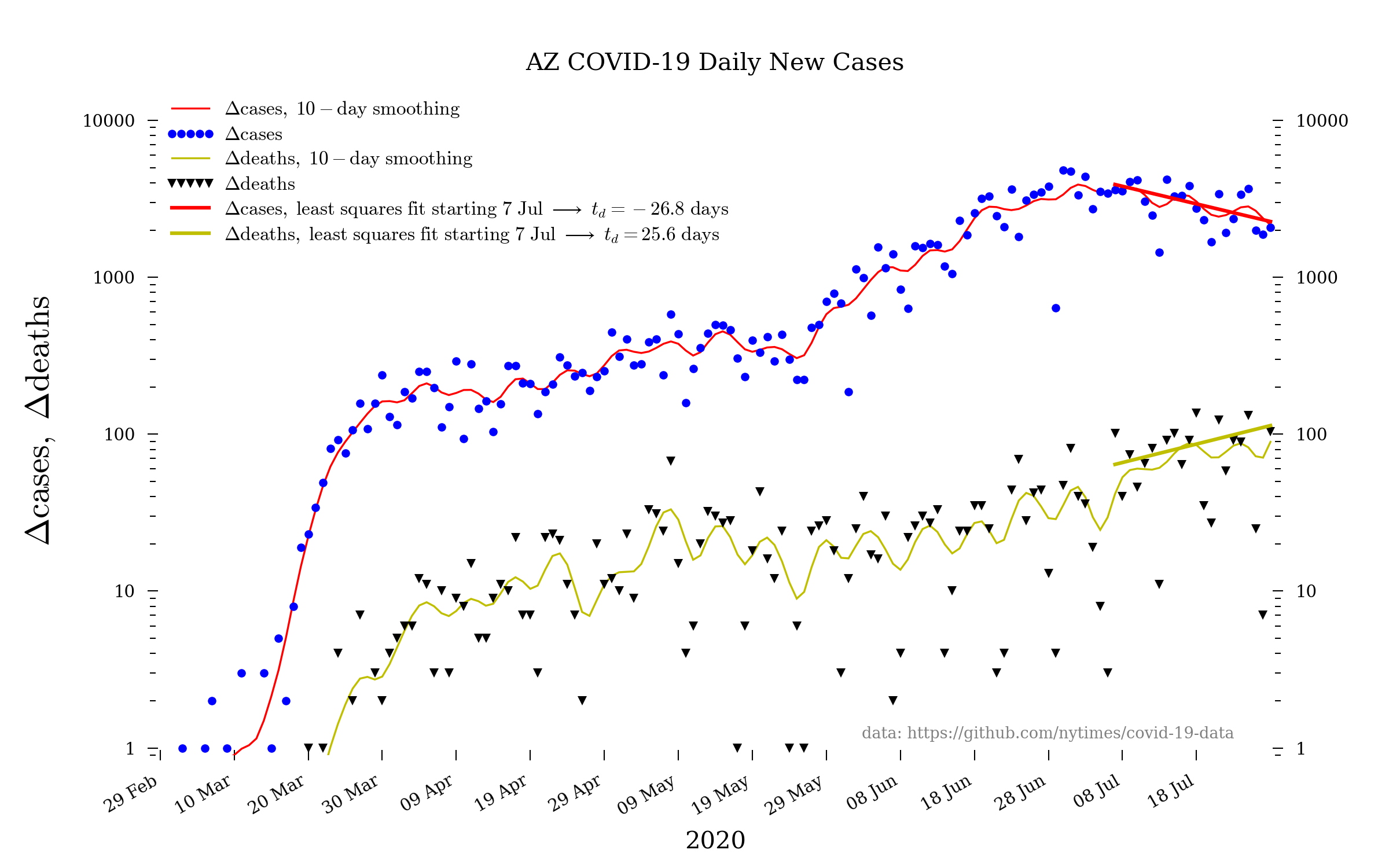
The log scale of the above plot is useful for showing that the increase in cases (and deaths) is still an exponential. However, to emphasize what that really means it is worth making the same plot but on a linear scale:
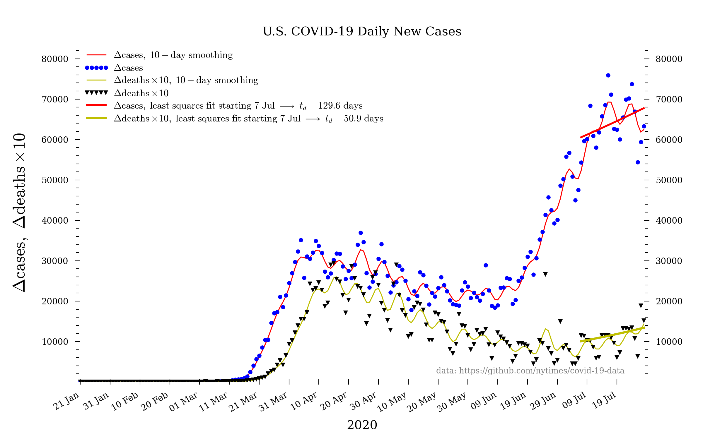
United States
Note: the United States continues to fail regarding testing, both at the state level and—especially—among the incompetent, inept, anti-science, know-nothing Trump administration. These numbers are therefore likely an egregious undercount. [Apr. 6: the U.S. is now admitting to “severe underreporting”.]
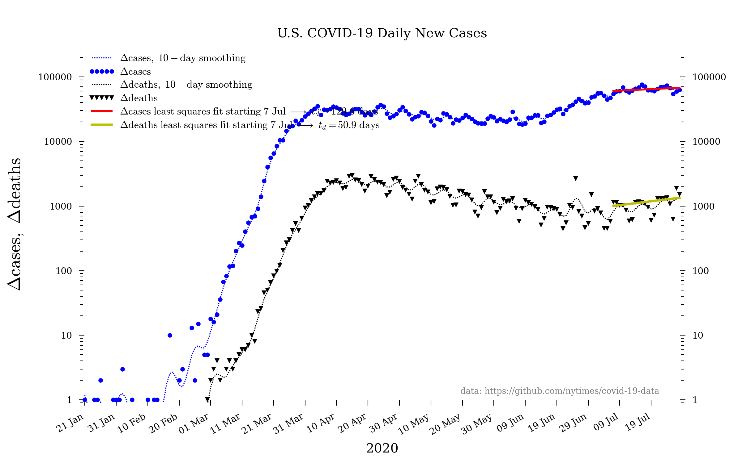
Here is the same plot but on a linear scale.
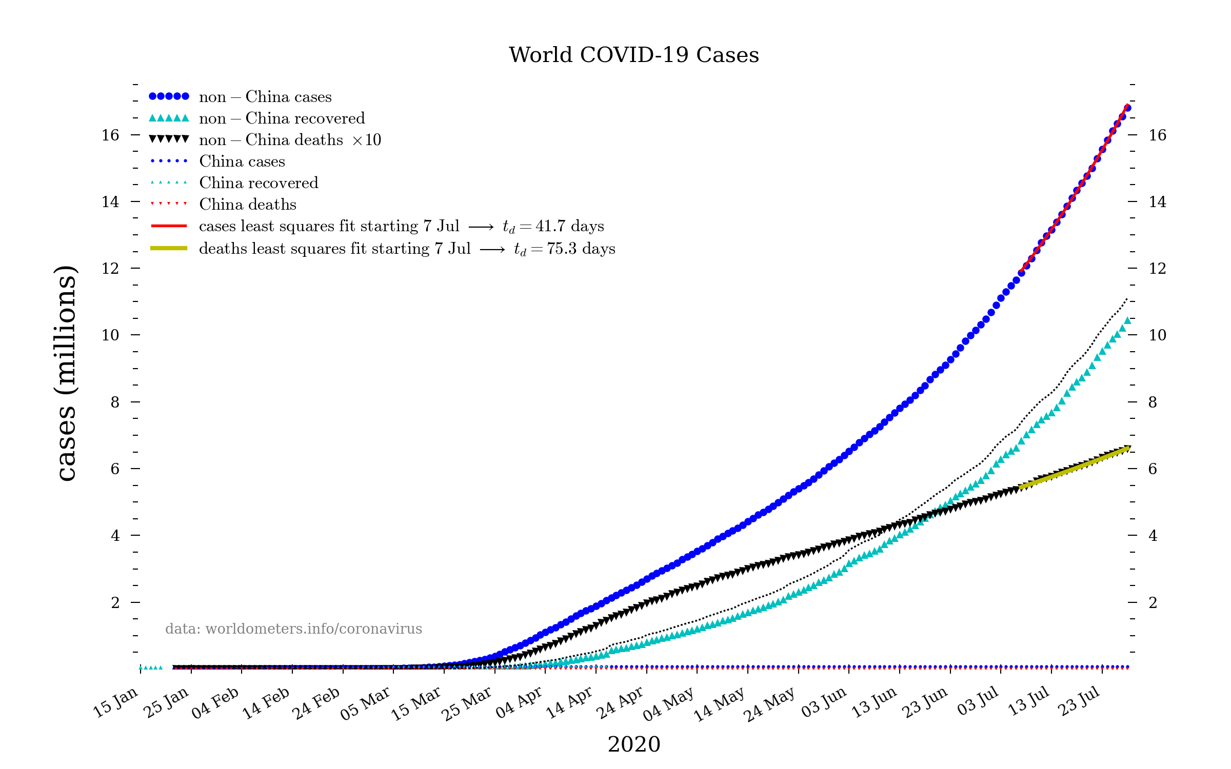
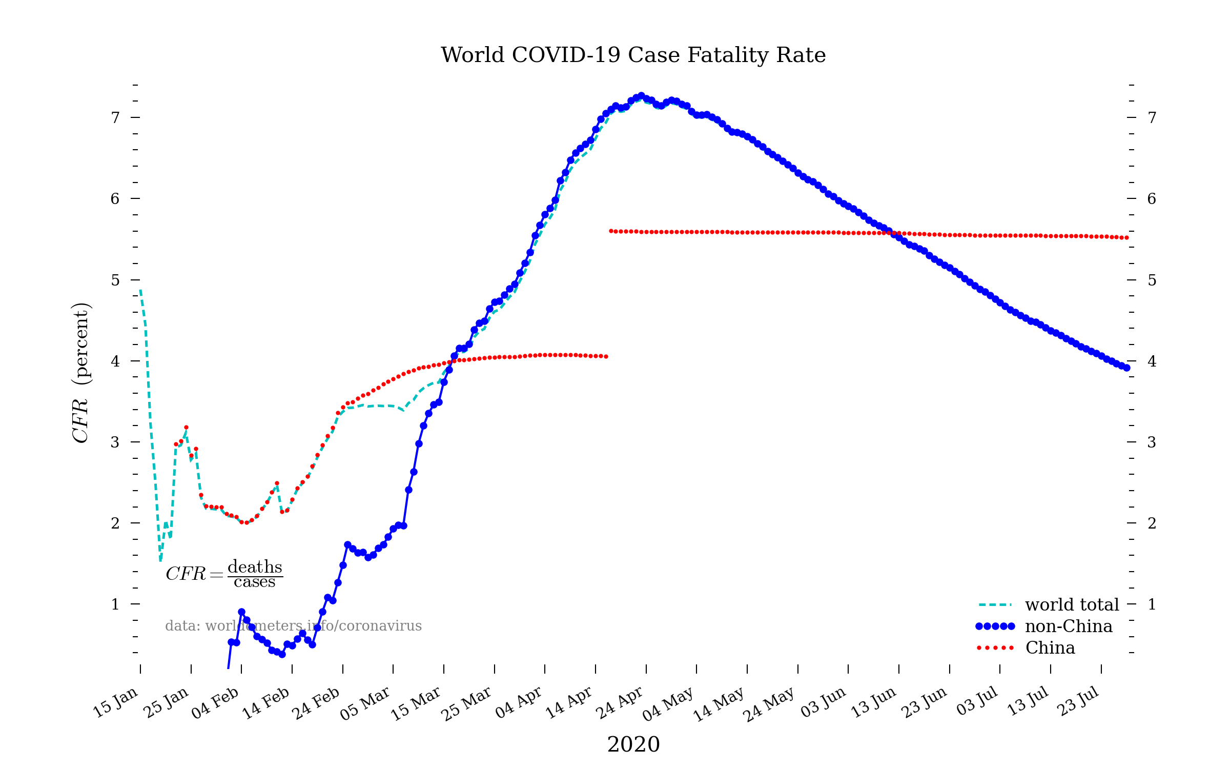
World

The doubling time of exponential growth
Suppose a measured quantity (such as the number of COVID-19 cases), call it $n(t)$, is growing exponentially:
\begin{equation}
n(t) = n_0 e^{c t} \label{exponential}
\end{equation}
where $c$ is a constant, the rate at which $n$ is increasing with time, and $n_0$ is the initial size of the quantity. This is a simplified—in fact, the simplest possible—description of an exponentially growing quantity. If we take the logarithm of eq. \eqref{exponential}, we have
\begin{equation}
\log{n(t)} = \log{n_0} + c t \label{logexp}
\end{equation}
We see that if we therefore plot $\log{n(t)}$ as a function of (linear) time, we should get a straight line with slope $c$. Indeed, this is a quick way to see if something is growing (or shrinking) exponentially.
In the plots above, the linear fits are least squares fits of a straight line to the indicated data.
A natural question is, “how long does it take to increase the quantity by a factor of 2 (or 10, or whatever)?” We can use eq. \eqref{exponential} to determine this. Suppose we want to know how long it takes to increase by a factor of $k$. We can write
\begin{eqnarray}
k \cdot n(t) &= & n_0 e^{c (t + \Delta t_k)} \\
&=& n_0 e^{c t} e^{c\,\Delta t_k} \\
&=& n(t) e^{c \Delta t_k}
\end{eqnarray}
where $\Delta t_k$ is the amount of time to increase by a factor of $k$. Thus,
\begin{equation}
\log k = c \Delta t_k
\end{equation}
or
\begin{equation}
\Delta t_k = \dfrac{\log k}{c} \label{k-period}
\end{equation}
With $k=2$, the doubling time is therefore
\begin{equation}
\Delta t_2 = \dfrac{\log 2}{c} \label{doubling-period}
\end{equation}
There is certainly a lot to find out about this subject. I really like all of the points you made. Felicia Derek Inessa